
Whilst physical posters and flyers for events still have a place, the majority of event promotion is now done online. I see a lot of DIY musicians making mistakes with their online show promo designs.
Here’s an example of an online ‘flyer’ or poster for one of my upcoming shows which I think works really well.
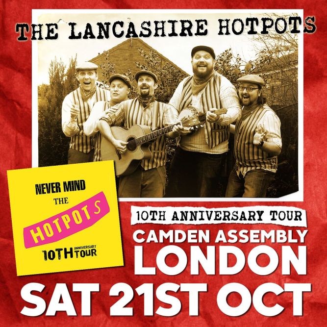
Here’s why I think it’s effective:
Format
Square or 1:1 designs are the ideal ‘shape’ for Instagram and Facebook etc.
Be Bold
Remember that 80% of the people on social networks are accessing through their mobile device. You need to keep fonts and text large and legible so people can actually read it! The larger your text is, the greater impact you will have.
Avoid small fonts which won’t be able to be read on a mobile device!
Keep It Simple
If you’re posting online there’s no need to include a start time or ticket link etc. Your post can include a link to the Facebook event or other ‘show page’ which will have all that information on. The main point of the image should be to raise awareness of the event.
Got any questions about this post or how you can better market yourself?
Twitter: @60secondmm
Facebook: www.facebook.com/60secondmusicmarketing
Categories: Uncategorized
